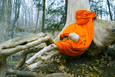
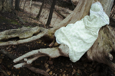
I guess I'll start with the two dress photos. Compositionally, these two photos are very similar; in the foreground is the dress and tree roots, placed off-center toward the right. In the background is forest, and the roots of the tree reach out and past the frame of the image. In the top image, more emphasis is placed on the draped cloth of the dress, while the second image places emphasis on the roots and dress as a whole "figure." Natural lighting was used for both, but contrast and clarity were manipulated more in the second image, producing a darker, slightly more foreboding image.
These two images address the idea of fashion photography. So many designers assert that fashion photography is not about the model, but if this is so, why do we put so much emphasis on who is modeling, and why use people at all? Here, tree roots serve as the life form on which each dress is "modeled." The top image seems more relaxed, as if the "figure" is leaning back against the tree, and the dress takes on a less literal form due to the draping effect. The image is lighter and more balanced, and perhaps more approachable. The second image is, in my opinion, much more interesting to look at, because it feels more surreal. The angle is slightly skewed, and the image is darker overall. The greater contrast between the ground and the roots makes the roots appear even more leg-like, since they seem less a part of the tree and more like deformed legs.
To make these images, I trekked out into a forest back in my hometown, and searched around for trees I could either draped the dresses in, or hang from. I had brainstormed a bit beforehand, trying to think of ways that clothes could be "modeled" without human figures, or if that was even possible. Clothes are, obviously, made for people, and that's why we model clothes on them; but a lot of fashion photography does place emphasis on the model (otherwise there wouldn't be such high standards of beauty for them), and I wanted to play with the idea that if designers assert that the model is not the emphasis, then why not model on other natural forms? What I ended up finding were roots, and so I placed the dresses carefully over two particularly leg-like roots and took some photos. Back in the lab, I saturated the colors in the orange dress (which actually wasn't orange at all, but red), and brought our some of the greens. The other photo I darkened and increased contrast in. I learned a lot more about manipulating colors in Camera RAW by experimenting with different looks.
Like I know I've said before, my intention was to create an interesting image that would cause one to question ideas about the modeling and fashion industry through a surrealistic, surprising fashion image. The conventions of modeling are tested, and if what the designers tell us is true (that the models don't matter and are simply hangers for clothing), then a tree should work as a model too, since it can serve the same function. Yet, the result is strange.
These two photos relate to the work of fashion photographers in general. The clothing is the thing that stands out in each image, and the "product" is placed in the foreground. However, the obvious difference is the use of the tree as a model, rather than a human being. Both are living things, but only one truly works, and designers should just admit that in fashion, there is as much emphasis on the human model as there is on the clothing. In the West, we have certain standards of beauty, and fashion advertisements sell not only a product, but a standard of beauty in general. When you remove this standard of beauty, we are left with only the product, but is it sell-able at all without that standard? Can fashion stand on its own in advertising? These are the ideas I was thinking about as I took the shots.
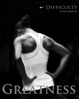
The third image is an advertisement, either as a poster or in a magazine. A lone figure stands centered in front of a dark background. Contrast was heightened to bring out the back muscles of the athlete, and the figure is framed by text on the top right and bottom. The lighting was actually a fairly dim light issuing from overhead florescents, but with a darker background the figure was able to pop a little more.
My image, as an advertisement, is about the struggle of an exhausted athlete. She has either just come from a disappointing or trying race or workout, and she pauses, hands on hips, breathing. Her gesture is one of either frustration or determination; a light shines down on her, highlighting her back, and revealing her strength despite those disappointments. She faces away from the camera, but by doing so, she becomes every athlete--a symbol of determination in the face of a daunting task. The words, a quote I found online, hierarchically place the most emphasis on the word "greatness," while the word "difficulty" seems small in comparison.
This was actually an older photo that I didn't get to use from one of our previous sets. I was shooting a picture of an entire scene, and caught this girl in a corner of the photo. In black and white, the shine on this figure's muscles really stood out, and I knew it would work well as an advertisement. I cropped the photo, enlarged it, and using burning and dodging, highlighted the girl while blacking out the background. This is probably the first time I've been able to successfully use this technique, so I was really happy with the result.
My goal was to create a motivational image; the advertising aspect of it came later. A lot of the Nike ads that I've seen don't even show the shoes anymore, since the brand is so well known, they only need to make a powerful image and stamp their logo on it. People know what it's advertising. That's why it was so easy to make this into an advertisement.
This work relates to the world of athletic advertising, and more specifically, to Nike advertisements. Most athletic advertisements emphasize power, strength, and victory. This is where mine differs. My ad emphasizes strength, but through difficulty, which is something that most advertisements try to skirt around. It's a much more realistic look at athletics in general; buying an athletic product won't automatically help you to win. It's about strength of character, and by allying itself with this kind of athlete, I think this push in advertising could give Nike and the world of athletics a fresh, less elitist self-projection. Things in this world quickly become institutionalized; what once began as a fun past time has become a lucrative business, and the pressure to do well, the idea that you can't be a success without winning, without outward success, is an idea that has all but ruined the original intention of school athletics. Athletics are an arena (forgive the pun) where we personally grow, and no one has the right to tell us that we haven't been a success just because we didn't win.
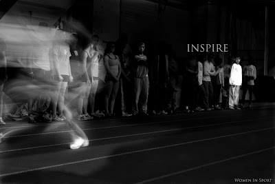
The last photo is not a Nike advertisement, but meant to be a billboard of sorts for some sort of campaign to encourage women to join a sport, and promote good sportsmanship. A line of people stands in the background, while a blur (a female runner) occupies the foreground for the most part. A single girl is highlighted, her eyes on the runner, a look of awe on her face. The image is dark, but the blur and shoe of the runner, and the person of the girl, are highlighted, creating a connection between the two. Lighting is natural, but highly manipulated in order to create the most drama.
This image is about women and athletics. A young girl (and if you look closely, several younger girls) watches an older athlete race by her, a picture of speed and strength. It is thanks to women athletes like the one running that a trail has been paved for younger athletes to follow. This image is about women athletes inspiring younger ones to reach for greatness, and although there is a difference in age (shown physically by their distance from one another), there is a singular connection.
I always loved this photo, and although it's a tad blurry, I've wanted to find a way to use it for a while now. This assignment gave me that chance. At the time, I was simply taking photos and testing different shutter speeds, but I began to think about the image with respect to this assignment, and I figured that a similar approach to the Nike ad might be interesting. This photo was entirely experimental in that sense. In camera RAW and photoshop, I darkened everyone in the photo except for the little girl at the end and the blurry runner, since I liked the distance it created. This took a few tries to get right, and I even experimented with highlighting various other girls as well, but the one girl seemed the most dramatic. This was another one of those images where I finally successfully used burning and dodging.
My goal was to create an inspirational image that would encourage women to go out into arenas formally dominated by men and inspire younger girls to follow after. Emphasis is placed on both the girl and the runner, and I suppose that they reciprocate that inspiration; the older runner inspires the younger to strive to become something great, while the younger inspires the older, in that she sees that what she is doing has a real impact on those around her.
This photo relates to the work of sports photographers and advertisements. It strives to make a bold statement like an ad, and to catch your attention, and it's highly dynamic--so dynamic that you can't quite make out the runner. In concept, it relates to more than just advertising though. So many advertisements play on stereotypes and the objectification of women, and although this has gotten better in recent years, there is still a double standard since the parameters for what kind of women appear in ads are more constricting than those for men. There is a special connection amongst athletes, and especially among women athletes, since for so long women were not given the opportunity to compete, and to this day women sports do not get the same recognition as men. This is what I hope to rectify to some degree through this image.
PART II
The two fashion images were, for the most part, interpreted as such. People seemed to love the concept, or idea, and one even mentioned that they reminded her of Harry Potter. They felt that the images were about personification, which is kind of what I was hoping would come across. Some felt that the images evoked fairy tales, which I'm happy about as well, since I really like fairy tales, and I know what they mean--there's something fairy tale-like about them, but I just can't put it into words. The ad images were read as ads, and most people thought they were both very powerful and dramatic.
For the fashion images, color is definitely working. People responded especially well to the "orange" dress one, and thought that the tree-as-figure concept was a great concept to work with as well. There wasn't a lot of critique about either; personally, I think I would have just liked to do more of these images. Had it not started hailing, I definitely would have! I was so disappointed I didn't get to search around for more tree roots! For the ads, people agreed that the lighting was very effective in both in creating drama, and that the text was well-placed. The compositions of each were strong too, but there seemed to be a general consensus that the highlighted figure of the girl in the "Inspire" image was perhaps a little too bright, and that the runner should have been highlighted more. I think I would tone down the girl a little too, considering how dark it printed, but not too much, since my intention was to put emphasis on the girl and connect that to the runner. Some thought that the font was hard to read, and I think if I had made the font a little lighter it might have stood out more, but I liked the font being a mid tone rather than white.
The fashion images would definitely make a great jumping-off point for a series of fashion shots using natural "models." Again, I would love to push this idea further. The ads could almost branch off into a series of inspirational posters themed around women and athletics--which could turn into a fun personal project for images to hang around our locker room :) .


 The Triumph of Pan (after Poussin) from "Roman Allegories" (2004)
 The Tourists from "Helen's Odyssey" (2007)


